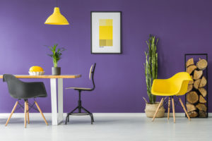
Colour schemes
We’ve all heard of colour schemes, but it’s a phrase that can be misunderstood. It can conjure up images of single colour rooms that lack depth and personality. A true interior design colour scheme balances choices of colour, material, and texture of everything in the room, from walls to soft furnishings to furniture. There’s no single way of bringing in colour to the home, but understanding how a colour scheme works is a great start. It’s only then that you can really start to coordinate such things as complementary, contrasting, analogous and triadic colours.

Colour themes
Of course, some people feel more comfortable with a theme rather than a scheme. This might be an interest that you feel passionate about, or an interior decor style that typically uses certain colours. The idea is to get inspiration for bringing in colour to the home; it’s a starting point. The tricky thing from here is to move from an initial theme to a whole room design. How will your furniture material fit in to the theme? Does the texture of soft furnishings support the overall concept as well as the colour? There are so many small elements to remember and consider that it’s easy to see why many homes employ an interior designer!

Colour patterns
When should you choose patterns over block colour? I’d suggest that you shouldn’t need to choose! I’ve layered stunning patterns on soft furnishings alongside vibrant colour to great effect. Take a look at my Chelsea Townhouse and Surrey Renovation for just two examples. How do you know when a pattern sits well amongst colour, though? Well, that’s all a balance between the colours involved, where you place a pattern, where the light enters from, and what else is going on in the room.
Lighting
It might surprise you to be thinking about lighting alongside colour – surely they’re different things? Well, not really. Your lighting choices will reveal different tones, textures and shades for each colour. And what makes this even more tricky is that light conditions change! Your room will look one way when bathed in natural light, and quite another when your artificial lighting choices come out to play. Then there’s colour in lights; smart LED mood lighting, glazed statement pendants, uplights, downlights, integrated lights, and the list goes on! Levels of lighting are an important design principle, and something that should really be planned in order to get the finished look that you want.
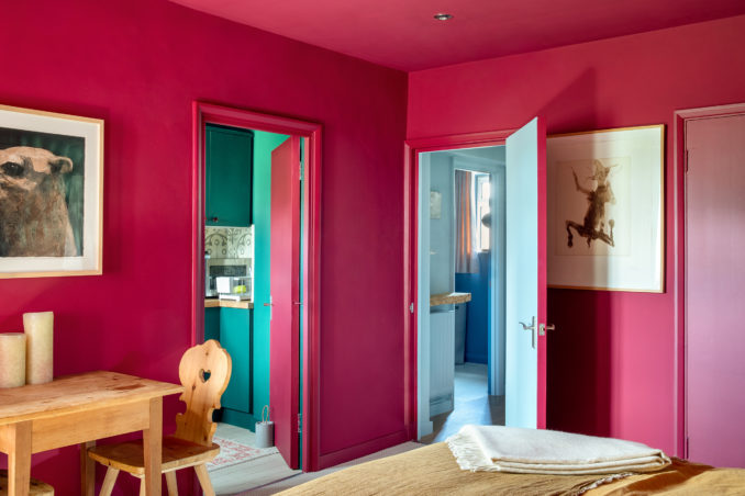
Breaking rules in interior design
How about when we think alternately for bringing in colour to the home? You’ll see these techniques on display in most of my projects as, quite frankly, rules are overrated! My East London Apartment and Studio Renovation are a couple of places to find inspiration. But what rules should you break? Well, the sky won’t fall if your ceiling isn’t white, for example. The same goes for things like skirting and doors. Similarly, you don’t have to have matching wood or metallic finishes across a room. Contrasts and imperfections are vital when it comes to creating an authentically stylish space. They just need to be intentional.
If there were to be a secret to bringing in colour to the home, then, perhaps intentionality is it. Like anything else, planning is the key and stops a room from looking like a jumble of ideas. An experienced eye is incredibly useful to create perfectly imperfect authenticity in your home interior.
Create a colourful home interior
Mix and match different patterns – stripes, florals, and geometric shapes, to add depth and dimension to a room. For more interior design inspiration also have a look at how to use colour theory in interior deign and Incorporate home interior design in any space.
