Using a Colour Wheel
The colour wheel is really important to understand complementary and contrasting colours. It’s not the be-all and end-all, though. Once you understand how to use the colour wheel, you can break the rules as well as follow them!
Playing by the rules
When we use the colour wheel to create an interior design colour scheme, it’s normally based on a specific set of rules.
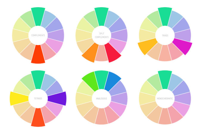
- Complementary – Complementary schemes take colours from the opposite sides of the colour wheel. A contemporary style choice here would be pairing teal with burnt orange.
- Analogous – These colours sit next to each other on the colour wheel and are important in establishing balance and harmony in a room. Schemes tend to look more understated and soft, taking different hues that blend together.
- Triadic – A triadic colour scheme takes three main colours, taken from three equally spaced points on the colour wheel.
- Monochrome – We often think of monochromatic schemes as black and white, but this actually refers to any scheme that consists of a combination of saturations of the same colour.
- Split-complementary – For slightly deeper colour schemes, use a split-complementary principle with a base colour and then the two colours either side of the opposite colour.
- Tetradic – These blends refer to a selection of two pairs of complementary colours. Think of a square or rectangle within the colour wheel. If one colour is kept as dominant, it will avoid the scheme looking too busy.
Breaking the colour wheel rules
Of course, rules are made for breaking and the colour wheel is no different! An interior design scheme that is wholly based on colour theory can be at risk of lacking character. Indeed, the colour wheel can be more helpful to describe a colour scheme after it’s in place rather than as a gospel of planning! There is no reason not to blend colour wheel principles when you select a piece of vintage furniture, for example. Or throw a bit of monochromatic grading in with your complementary base colours.
How Colour Affects Mood
Most importantly, when interior designers think about colour, we consider how these colours will make our clients feel when they spend time in a room. This is where colour temperature comes into play. So how does colour affect our mood?
Feeling Calm
According to colour psychology, cooler hues such as blue and green create a sense of tranquillity. They are the colours of nature and so can help to ground us. They are popular for the rooms that we tend to want to relax in like luxurious bedrooms and beautiful bathrooms. The tone is incredibly important here so keep hues soft: neon green is not so calming!
Feeling Creative
Bright and warm yellows and oranges are energetic colours that establish an atmosphere of creativity. It’s a popular approach in meeting rooms of new media corporations. But a home is, of course, different. A playroom or kitchen can benefit from the energy that these colours bring.
Feeling Fresh
If you want to make your room fresh and airy, you need colours that maximise natural light. Neutral tones are great for this. White, grey and creams are cool and pure. However, the risk here is that a room becomes bland, so introduce some kind of colour even if it’s a nod through accessories. The Japandi style does this beautifully, energizing natural tones with pops of colour.
Feeling Elegant
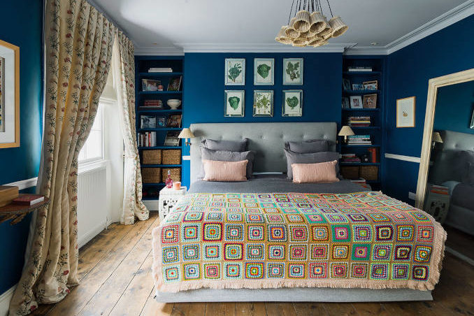
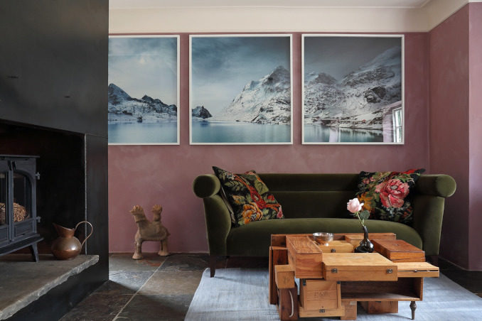
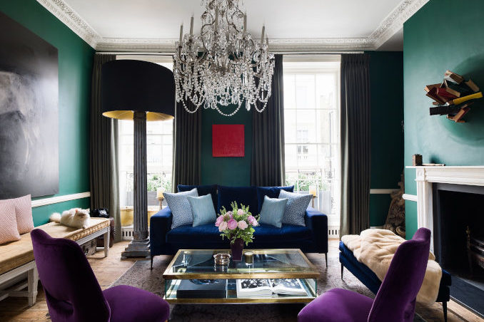
To elevate your hallway or formal dining room to a truly elegant space, choose deeper jewel tones. This might be navy blue, regal green or rich plum. We associate these colours and tones with luxury and confidence, both important signifiers for class and elegance.
Feeling Sensual
Deep, warm colours like reds and pinks have an enveloping nuance that creates a sensual mood in a bathroom or bedroom. There is a reason that they are all over Valentine’s Day cards! But these colours are a fine line to tread to avoid tipping over into the gaudy, so don’t overuse them.
Interior Design Colour Perception Tips
Choice of colour, where it’s placed and its tones and hues all affect our practical perception of a room. This is really important when it comes to building an atmosphere that allows us to live comfortably and authentically.
Make a room feel bigger
If a room is small or has low ceilings, we can use colour perception to help to make it feel larger. Monochromatic schemes are great here. Keep a single colour from the skirting to the ceiling to make the walls feel taller. Choose lighter hues to maximise natural light that creates the feeling of space in a room.
Make a room feel warmer
It’s not just a case of choosing warm colours to make a room feel warmer. Texture and depth is just as important. Layer your colour with two-tone walls and complementary soft furnishings. Using natural materials is a great way to create a warm room, so think about how natural wooden tones sit in your colour layers.
Make a room more intimate
If a room is cavernous, colour can help it to feel more welcoming. Choose a strong colour on a contrasting wall to bring the space together, or use colour on the ceiling to help to close the space.
Make a room feel established
You can create texture to a colour scheme with furniture and accessories. Everything from seating to lamps to coasters play their own little part in building depth of colour in your room. This is why it’s so important to find the perfect piece!
Defining Your Interior Design Colour Palette
So, bearing all this in mind, how do you plan your own interior design colour palette? Should you follow colour trends or go with your instinct? My biggest piece of advice is actually to not overthink it. It’s important to understand how colour works, but never ignore how colour makes you feel. A successful interior design should reflect your character and history, not just a theory or a trend.
